12 High-Converting Landing Pages For Capturing Emails [2025]
![12 High-Converting Landing Pages For Capturing Emails [2025]](https://d1coqmn8qm80r4.cloudfront.net/lf03vtuke2ktkxk14vgfwh5kh49w)
If you plan to run any kind of campaign, you can't get around landing pages.
One of the most important elements in conversion optimization is your landing page. It is the very first impression you make on your new visitors and it will determine a lot of things; whether they buy your product, share it on social media or even come back.
But getting your landing page to look amazing and convert well can be a challenge.
In this article, we discuss what a landing page is and share some of the best landing page examples.
What is a landing page?
Just like the name suggests, a landing page that has been built to inspire the website visitor to fill in an email address is referred to as an email capturing landing page.
It is no less than a transaction wherein the page provides some information or offers to the visitor for no cost in exchange for their email address.
The majority of lead generation landing pages have a form available or lead visitors to one when they seem interested.
What should I include on my landing page?
Here are some valuable tips for creating a high-converting landing page:
- Make a product-fit landing page that is personalized and provides the proper reassurance
- Keep your landing page brief – no one likes reading through a landing page that rambles on and on
- Pop-ups are the ideal way to engage the page visitors
- Add social proofs and testimonials
- Have an exciting call-to-action or CTA – move above the 'sign up’ title and go for more interesting button titles
- Include some great offers and discounts on the site in exchange for the email address, such as a welcome discount
Many other features will upgrade your landing page into a high-converting, email-capturing one.
Let's go through some fantastic examples on the internet to know what works!
1. DesignLi
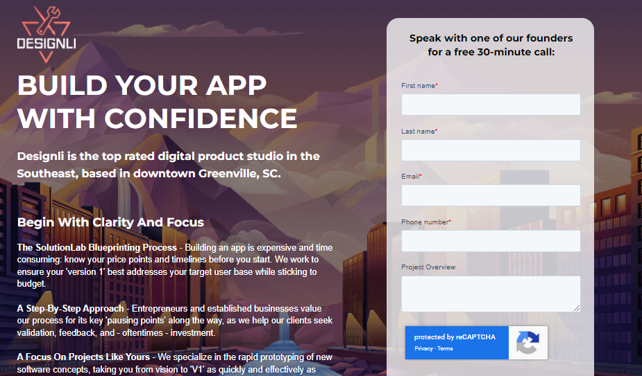
DesignLi aims to provide an offer for a free 30-minute consultation call with the founders, and for that, they entice the visitor to fill in a simple form. A filled form will have the visitor’s email address! And there, you have one of the best email capturing landing page practices.
Key Takeaways
No unnecessary information – there are no distractions to ensure the visitor is only directed toward one option
Fab headline – the headline provides a solid value proposition
Straightforward form – the form starts with action-inducing language and can be filled in less than a minute which makes it an easy deal
2. Morning Brew
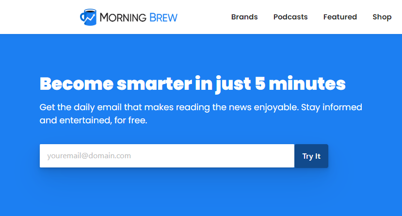
The biggest factor which makes the Morning Brew site attractive is the solid catchphrase – Become smarter in just 5 minutes. This acts as a unique selling proposition that attracts visitors to know more. And to do that, they have to enter an email address.
Key takeaways
- Clear USP – you will always win if you tell the users what they will get in return by being clear and concise
Great visuals – the huge hero image is a nice sneak peek into what the user can expect out of Morning Brew
Brief and straightforward page – only talks about what is required
3. Sales Force
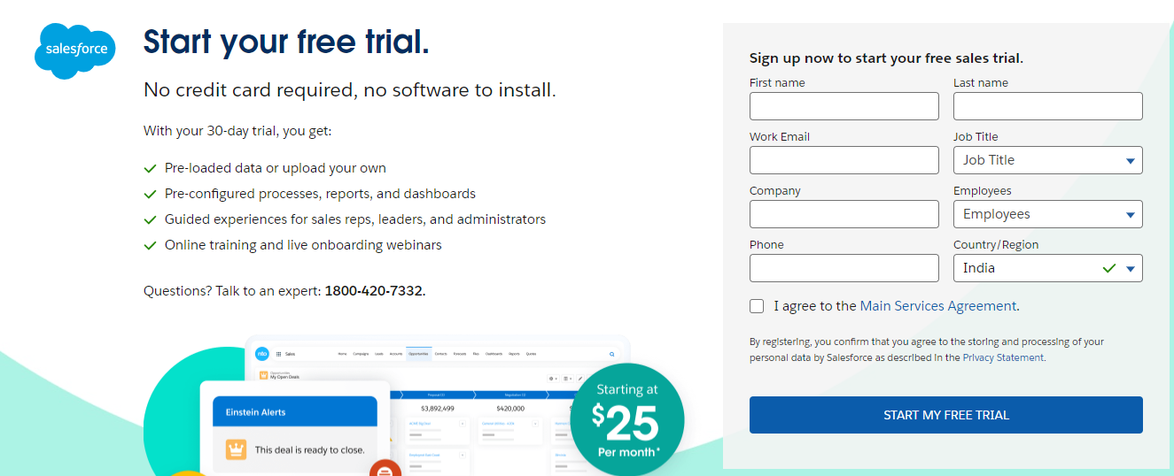
Once you check out the main website of Sales Force, you will see a button right on the top saying – Try Sales force. Clicking on the button takes you to a no-nonsense landing page entailing all the essential details, benefits, and offers at Sales Force.
Key Takeaways
Bulleted benefits – the advantages of signing up for the free trial are listed for reading in a simple manner
The offer itself is rather incredible – thirty days is a long enough and extensive time for a free trial which itself attracts the visitor
Let’s chat pop up aids in clearing any user doubts then and there
4. CXL
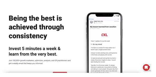
CXL targets the newsletter concept with a short and sweet landing page. With a promise to help users learn in a limited time – CXL makes for a high-converting landing page that enables email capturing at its best.
Key takeaways
Short lead capture form – the form is relatively straightforward for the users to fill quickly in
Engaging animation – the example newsletter is great-looking, without which the page would have been dull
5. Freelancing Females
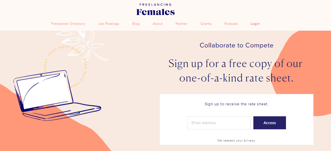
The landing page for Freelancing Females is based on an email address filled up in exchange for a free copy of the rate sheet specimen. The beautiful pink colors and the blue text and drawings add to the appeal of the web page.
Key takeaways
Informative bar – the bars and menus on the top might be distracting for some, while others would deem it as a perfect way for the interested user to know more
Catchy phrase – usage of phrases like one-of-a-kind elevates the readers' curiosity and potential customers
6. Surfer

We checked out a Surfer webinar landing page from last year, and boy, what a landing page! They transformed the webinar idea into a roast to keep the people interested. The landing page has details and information, smart CTA, and host images that add to the overall positive impact.
Key takeaways
Credentials of the host – the pictures and details of the host have been added to ensure that readers are interested in the event
Social proof – testimonials from the participants that were a part previously, allow the visitors to know that the webinar is truly worth their time
7. Next Draft
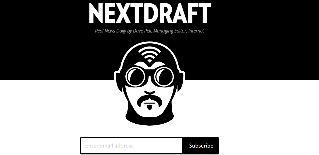
Next Draft focuses on its core value of being fun and interactive as it builds its landing page. The presentation and background clubbed with the easy sign-ups is a wonderful add-on to engage customers and subscribe.
Key takeaways
Work on your copy – having a cool aesthetic will always help grab clientele and customers on landing pages
Easy fill – make sure that, just like Next Draft, you have a landing page with a straightforward form to fill
8. Pexa Park
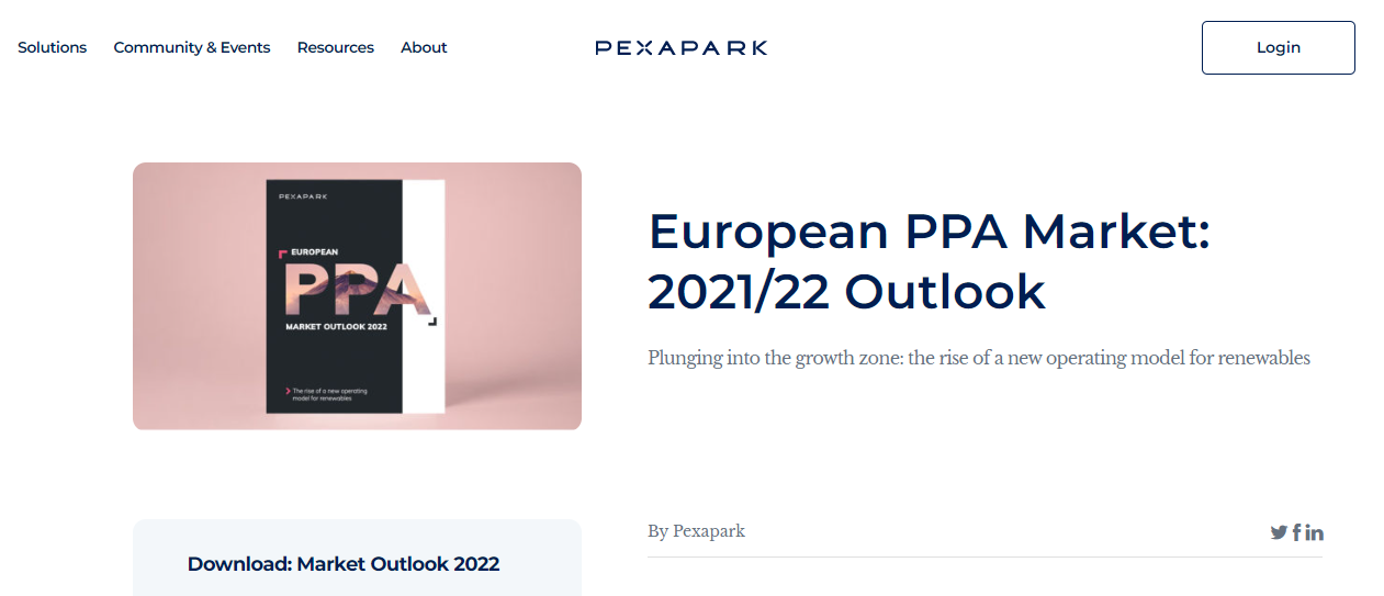
Pexa Park is a renewable energy software form that provides users with a free report in return for filling a lead capture form. Keeping the copy technical and promising ensures that the ones from the industry understand the nitty-gritty of the same.
Key Takeaways
- Benefits visible to all – the landing page truly wins by including a section highlighting the advantages of the report
9. Shopify
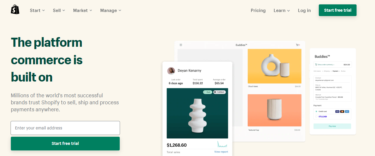
Shopify is one of the most successful brands globally, and there's certainly a reason behind the same. The landing page offers you to try Shopify for free for 14 days, without any credit card details – all in exchange for entering your email address.
Key Takeaways
Genius benefits button – the CTA of this site attracts a suitable customer base with an awesome trial in exchange
Purpose – the landing page also describes what all a user can end up doing with Shopify. These users are thus, informed about the advantages of Shopify.
10. Jack’s Flight Club
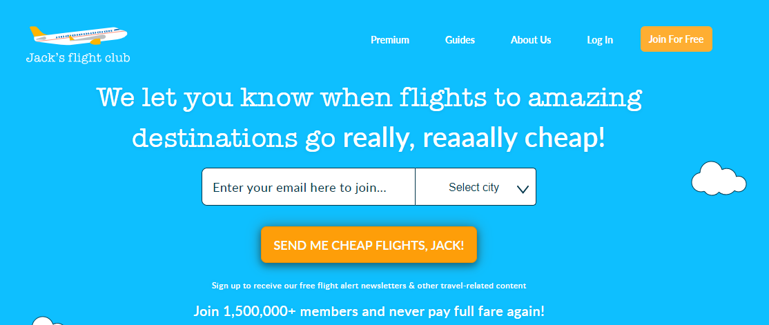
We are in love with Jack's Flight Club's landing page presentation. The catchy headline, fun CTA title, and social proof will definitely push you to enter your email address.
Key takeaways
Fun headline – Wouldn’t you want Cheap flights to fantastic destinations directly to your email? We are sure you would, and that is how Jack's Flight Club entices you
Details – the landing page is simple yet has all the vital information required by a user. It also includes the big names where the firm has been featured
Nice presentation - the cloud background works well in alignment with the services offered by the site
11. Stitch Fix
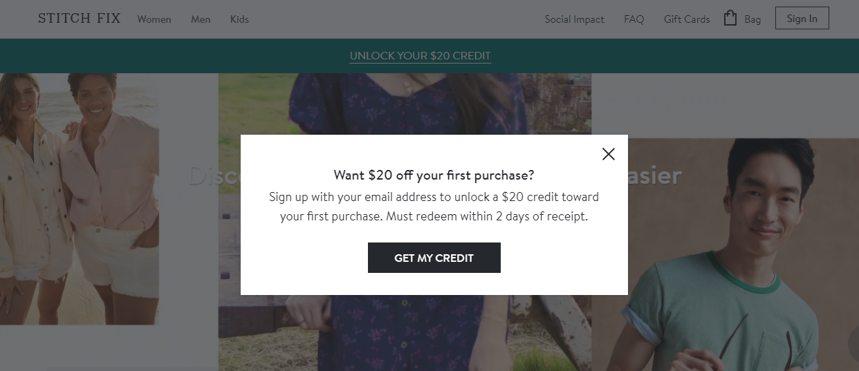
Stitch Fix sends users clothing that is likely to look good and fits well according to their tastes. The only catch is you need to fill in the style quiz, which needs their email address to deliver you these goodies. The email is personalized and inspires you to complete the profile and be a member.
Key takeaways
Personalization – one of the best ways to generate leads is to get them something personalized and fit for them
Effective interface - the site is also very interactive with the benefit to unlock USD 20 credit on signing up
12. Close
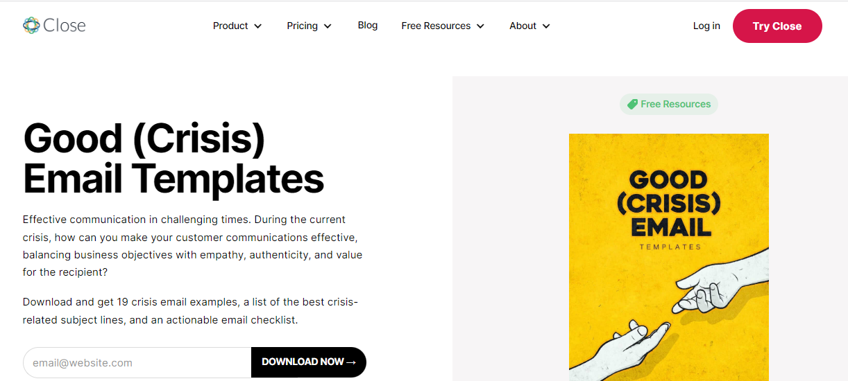
Close, a firm that provides CRM platforms for smaller enterprises, has an enticing lead magnet landing page. All you need to do is submit your email address in exchange for an aiming template collection by the company. The offer has been written clearly on top of the site, so you don’t definitely don’t miss it!
Key Takeaways
It's all about the offers here – Close focuses on benefits that come along with the template, entailing six examples of offerings by the downloadable resources, a brief video, and eventually, cutting right to the chase with a free trial offer
Single email field – the email field is all you have to fill and is present high up on the page so as not to distract the user
Conclusion
Well, that’s all from our side on the 12 high-converting landing pages for capturing emails. Email addresses form the crux and core of building a solid customer base – and with the right landing page, you can definitely achieve that.
Take a look at all these landing pages to know what worked for them and how you can implement the same in yours. We are confident that you will find something to your liking.